Project Name
SBI CAP Securities
Role
Visual Design, Prototyping, Style guide
Tools
Adobe Photoshop, Adobe Illustrator and Invision,
Team Size
3
Platform
Native
Duration
April - July 2018
SBICAP Securities is the broking arm of the State bank of India, one of India’s largest public sector banks with the largest customer base. SBICAP Securities wanted to revamp their existing application to cope with growing competition led by private sector banks, NBFCs and other FinTech startups.
Based on the brief received, the app was customized for various types of users by profiling the users and providing the best suitable financial solutions. A host of new features and functionalities were added to make it engaging and easy to transact.
Challenge
To empower investors and traders with a best in class, intuitive platform that enhances customer engagement and enables higher relevance in business
Approach

The approach begins with design strategy decisions which cater to key aspects of offerings while integrating them seamlessly into the working environment of the app. After the initial design decisions were taken, we followed our ideology wherein the best practice was to begin with a low-fidelity wireframing process and sketch the home screens, dashboards, and the user journey, etc. all the while keeping security as a top priority.

-
Enable quick transactions to improve convenience
-
Increase customer engagement
-
Reduce customer service load by making the app intuitive and by making data easily available
-
Create a one stop shop for all customer needs
-
Generate more leads by making pre-login content more engaging
-
Increase stability
-
Increase transactions
-
Increase market share by increased volumes on mobile
-
Ensure data security to generate a feeling of trust

Few points that came out strongly during the interviews.
Likes
Dislikes
Frustrations


Suggestions
-
Market depth to be available on the order placement screen
-
More advisory and research calls
-
Help text where trading terminologies are complex
-
Automate stop loss feature for intraday orders
-
Showing research calls before market hours
-
Showing quarterly results and annual reports of stocks
-
ITR filing format to be more comprehensive
-
Showing featured stocks
-
Post login users should land on to recommendations for the day
-
Feature of “why this stock” to show the basis for recommendation
-
Using confirmation PIN while placing the order on call
-
Research calls need to be more accurate and provided well in advance
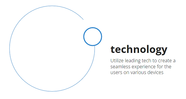
Technology plays an important role in building a user centeric product. We analyzed direct competitors and some international benchmarks to evaluate good to have features and industry standards
-
Profiling based approach to serve relevant content to different types of investors and traders
-
Guided approach for beginners through informative articles, guided intro, contextual help and user hand holding
-
Usage of customizable, interactive graphs and charts to help the user analyze effectively on the app without having to refer other websites for this task
-
Micro interactions that highlight the most important information and aid in taking
-
Efficient search that is easily accessible from any screen
-
Intuitive navigation that is based on the user’s mental models and enables easy access with minimum clicks
Competition Benchmarking
Objective of this analysis was to inspect and evaluate strategic decisions, domain wide solutions and design trends in current competitive websites and subsequent benchmarks by conducting market research. This was crucial in order to identify the competitors, user persona, alternative solutions, etc.
Kotak Securities

Good
Bad
-
Visual cues for refreshing rates
-
Customization of dashboard
-
Post login items greyed out in navigation
-
Integration with BTV Live TV
-
Clean interface
-
Simple navigation
-
Easy transaction flow
-
‘How to use’ prompts on new screens
-
Distracting splash screen
-
Wastage of real estate with login
-
Calls to action on widgets
Edelweiss

Good
-
Clean interface
-
Persistent bottom navigation
-
Prominent search
-
Easy filters
-
Quick access to different asset classes
-
Ability to deep dive and do 360 degree analysis of stock data
-
Upfront and persistent access to trade
-
Left and right navigation
-
Easy access to indices and market overview from every screen
-
Coach screens for first time users
Bad
-
Limited real estate due to frozen header and tabs
HDFC Securities

Good
-
Progressive display of information in portfolio
-
Integration of research and demo videos
-
Post login items greyed out in menu
-
Upfront bottom navigation
Bad
-
Outdated menu display
-
Poor visuals
Design
Using the objectives and takeaways from market research, internal briefings and client feedback, the design process was initiated with a few key factors at play. Using Business use cases, user-use cases, etc. as basis for design directions, fonts, colors and iconography were chosen.
Colours

The color palette was conceived in dominant shades of blue and yellow to invoke a sense of trust, loyalty, optimism, wisdom, confidence and brand recall.
Text Font

Modern, contemporary Sans Serif and Montserrat typefaces have been used across the site. The light weight on both forms a simple and elegant visual output. The geometric types are optimized for digital usage and are excellent choices for minimal and modern websites & mobile apps.
Number Font

Additionally, we choose Roboto Condensed for numbers because of its lower kerning. This enables an extra space for numbers that go into lakhs, and offers the additional benefit of not crowding the view.
Iconography

Icon style is new age with an emphasis on products. Icons are dual toned and filled to bring depth and dynamism to the interface. Illustrations, on the other hand, are flat to create a complementary set of visual styles.
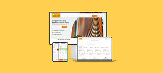
Final Design

Reflection
This was an intense learning experience encompassing everything ranging from market study, product acclimatization, user-study, feedback & testing analyses, prototyping and iterative design processes and new product development.
The scale offered by SBI was an ideal platform to execute our learnings from various projects and other experiences.